VinoDeco_v218green1_Cyanapp_absolute.pdf
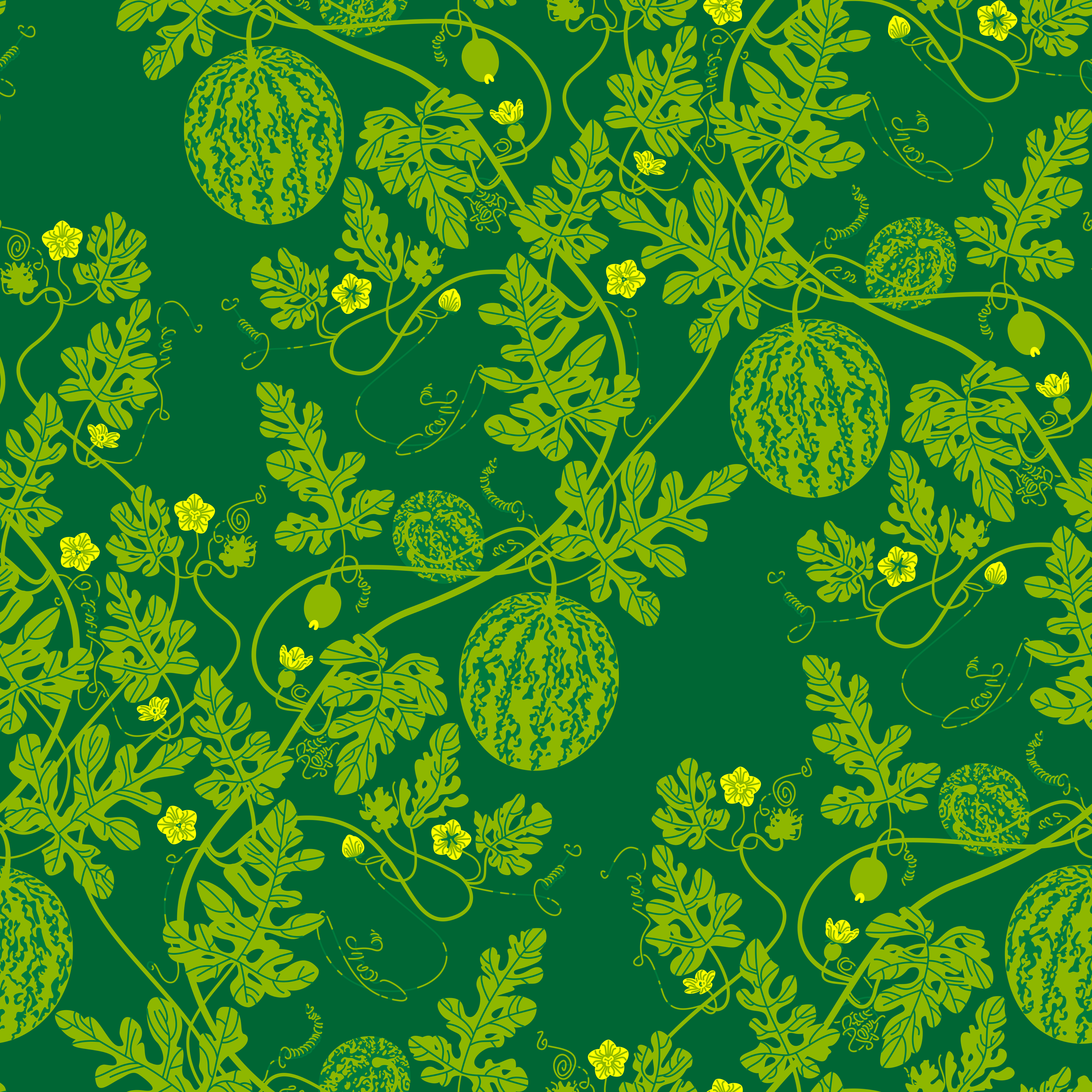
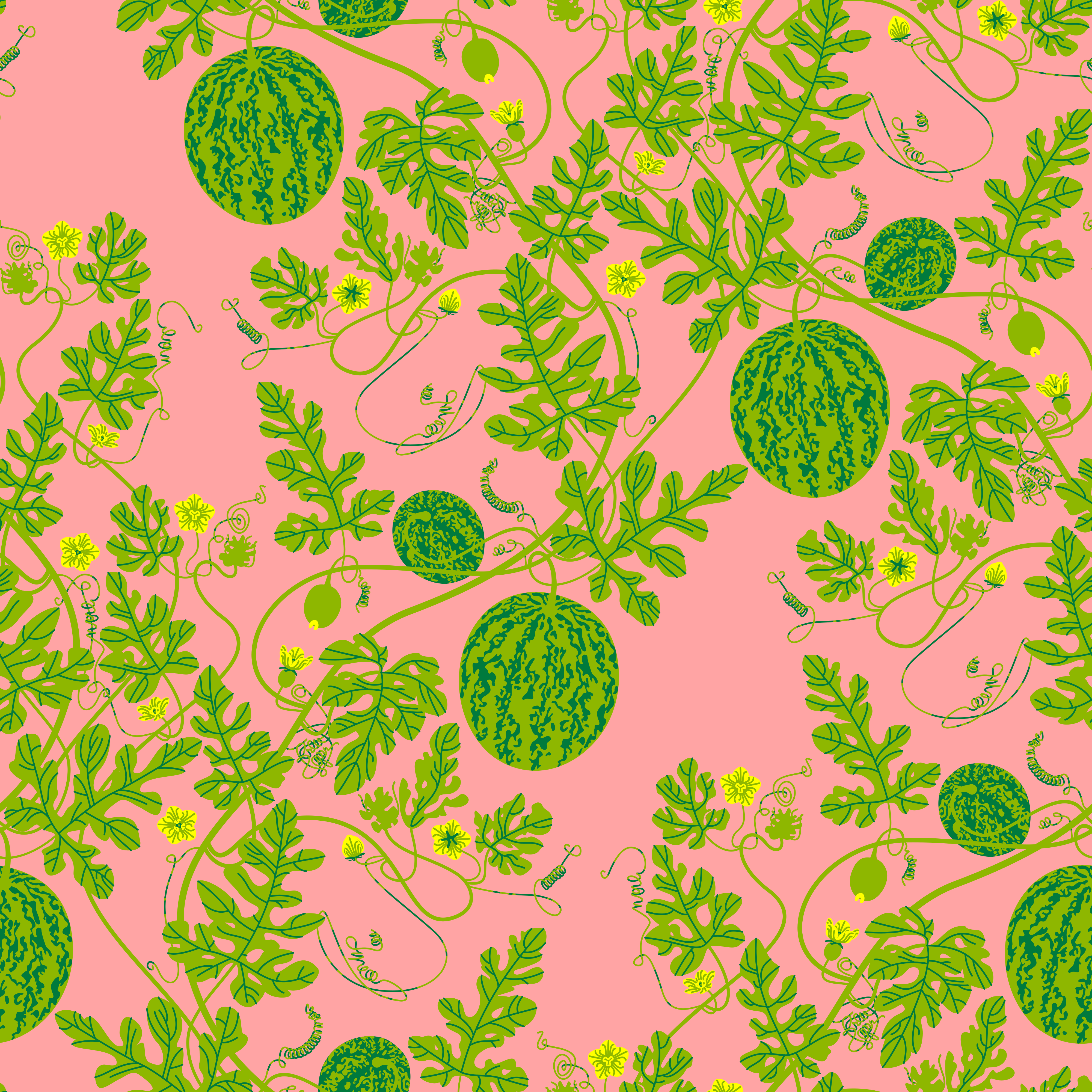

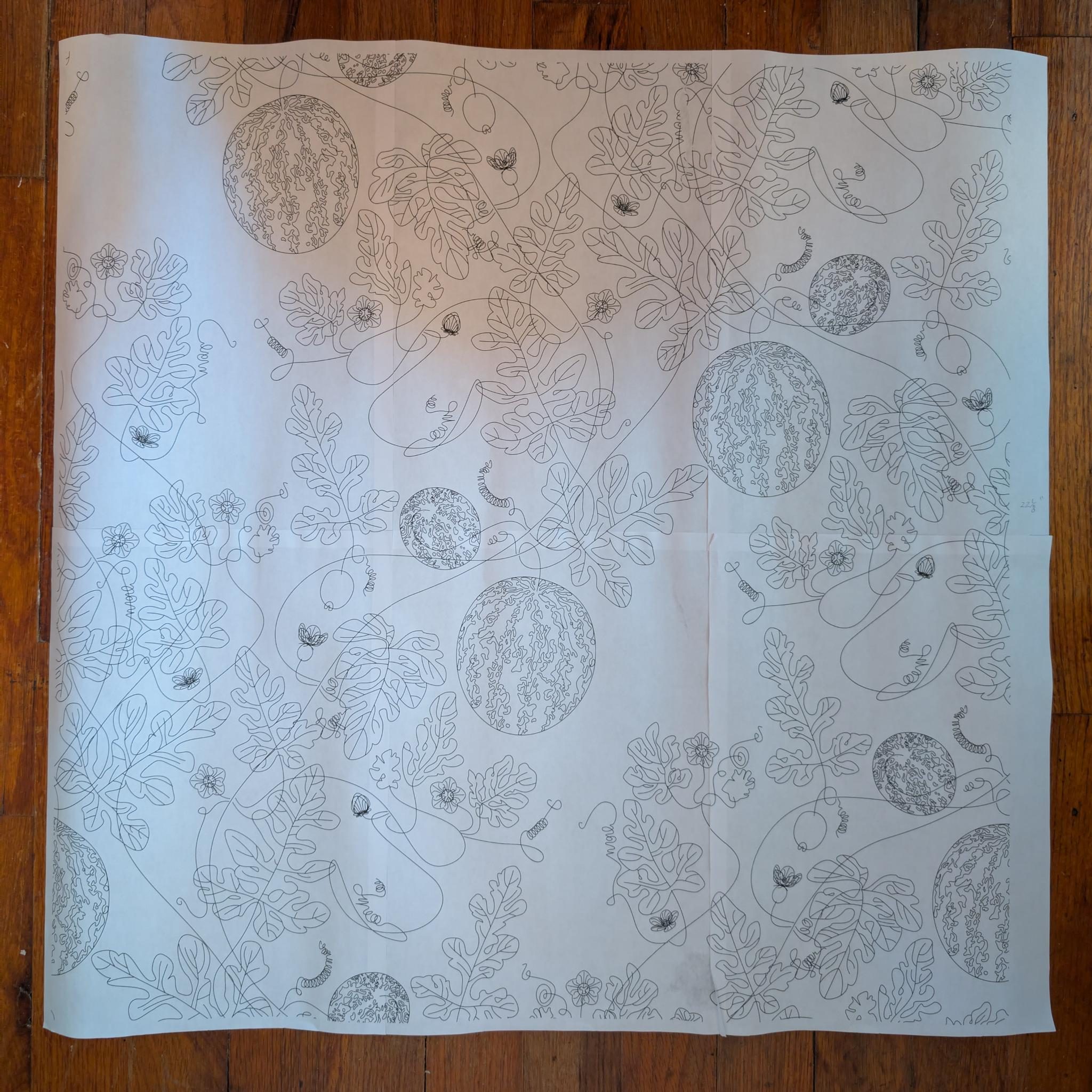
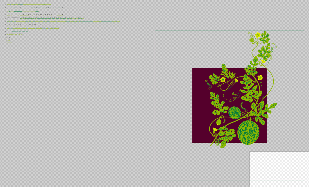
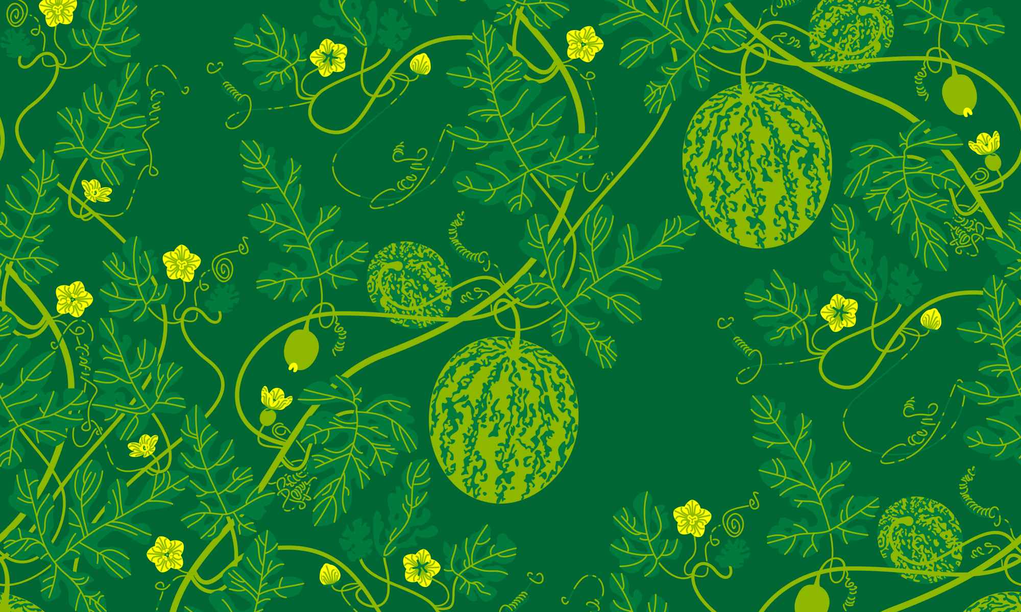
My watermelon vine tiling surface design itself is nearly done now that I have the tendrils mostly figured out. There remain several elements to tweak, mostly proportions considering final print dimensions, and then line weights and color schemes to make sure everything works for color variations. Also, do I want to try and make the outlined versions viable again?
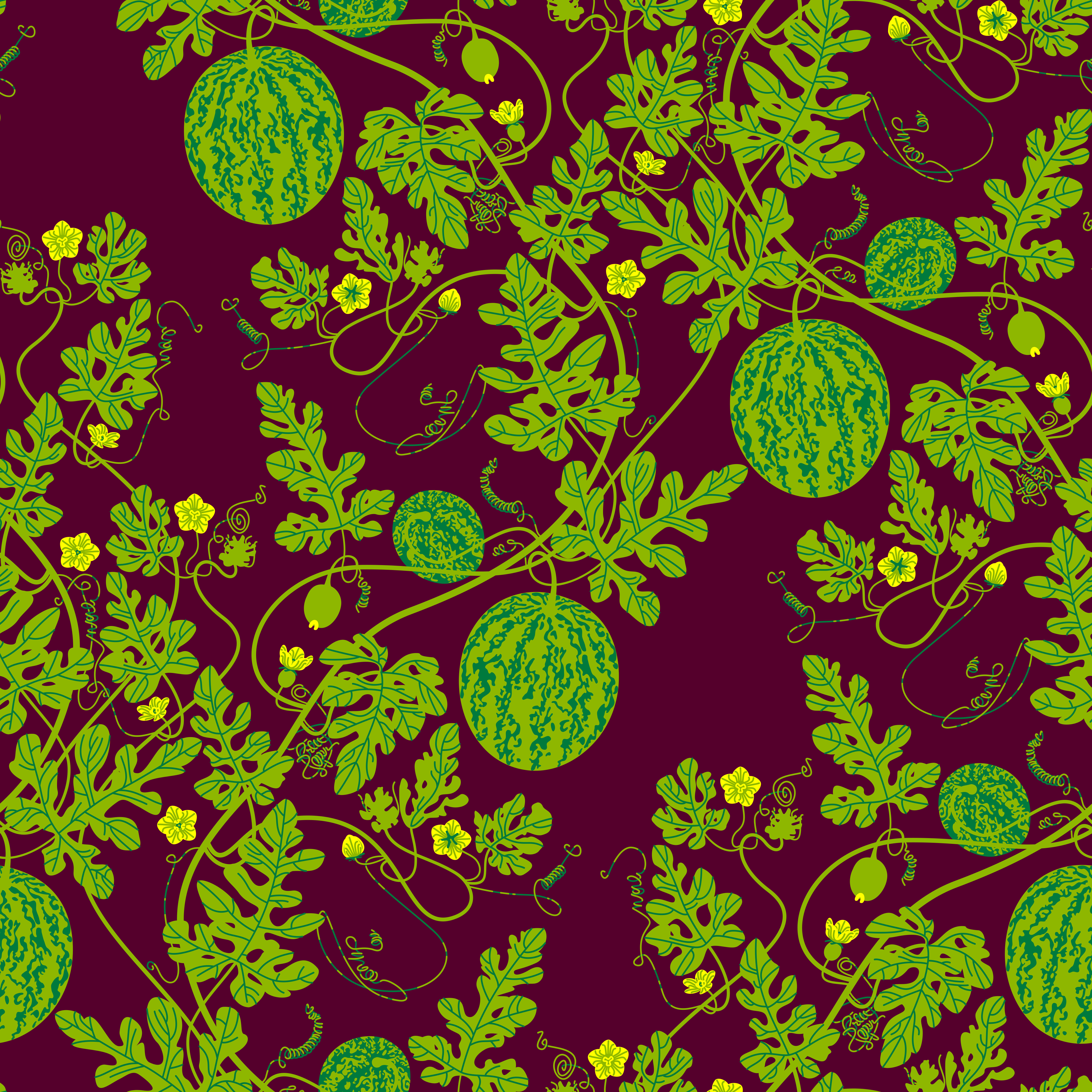
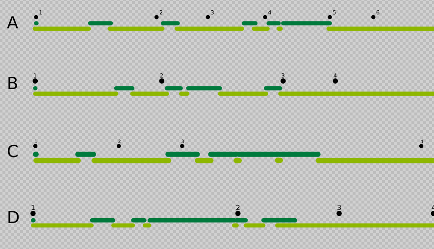
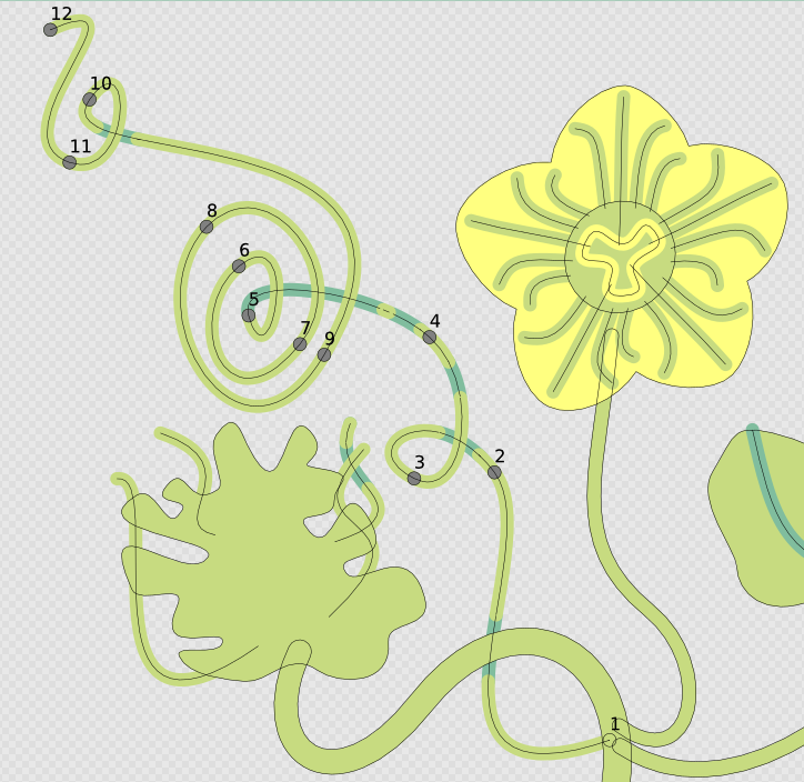
The tendrils I spent time trying to effect a good overlap or lighting indication, I ended up on doing overlapping segmented paths, which works well for the solid-fill color scheme but not so well for the outlined versions as Pattern Along Path isn’t aligning the two paths with utter exactness. Right now with two vine greens it looks fine on the slightly darker green which is the flagship color. On lighter colors like the bubblegum pink I did most of the early work on this design with, the darker green looks black and the lighter green disappears. Also, the two tone vine and the outline problem complicates the intent to do a high contrast strictly black and white version which I got a lot of particularly positive feedback on at an earlier point in this design process. Ultimately CMYK tweaks are gonna be necessary as well. Is inkscape
For the two-tone tendrils I used the Pattern Along Path live path effect, in conjunction with Prickly Gorse’s Inkscape Extension for Automatic Pattern Making: Unroll Path which was intended for fabric bag construction. Pattern Along Path LPE necessitates for aligning the two paths that there are vestigial underlaying dots for the base color as a sort of register at the ends of the paths. I might just leave the the dots in place depending on the scale of the print, but I could always have a duplicate for each tendril that’s destructively flattened edited for each color and line variant, a tedious prospect. All in all this method was very labor intensive, I don’t particularly recommend it.
Preview renders of outside applications can’t decide whether they get along with Pattern Along Path LPE or not. Sometimes internally Inkscape acts up as well, with diffeent Live Path Effects needing to not just be turned off and on again but deleted and recreated to render correctly, so flattening may be an inevitability anyways.
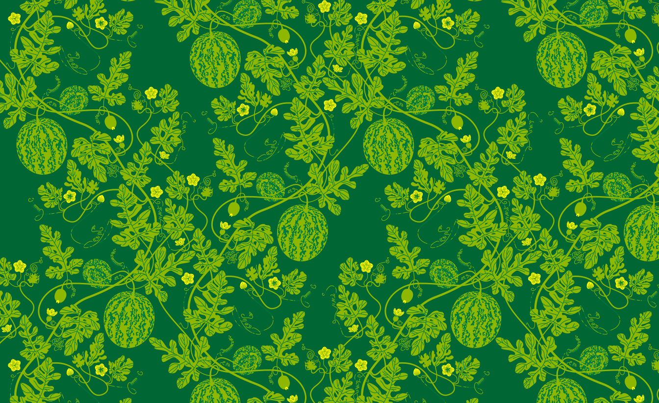
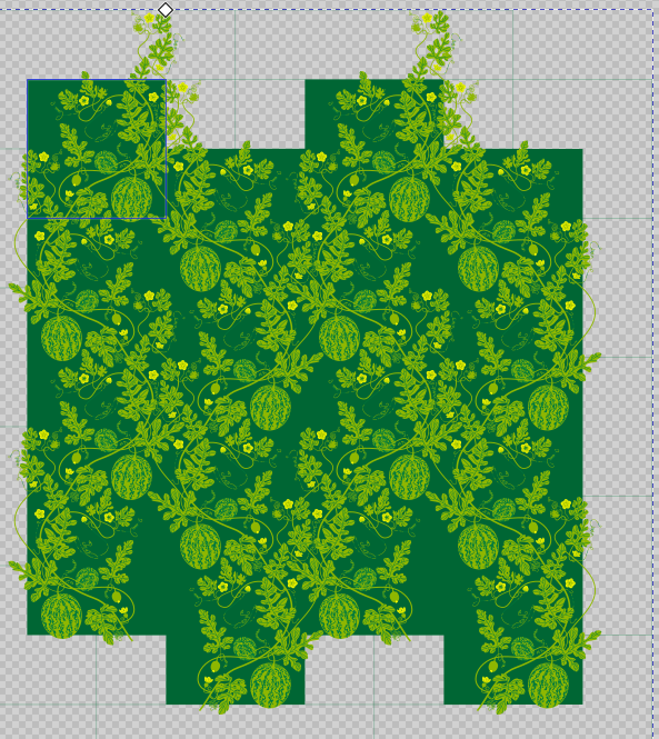
I did a test print at scale to see how I felt about the general scale of things for wallpaper purposes. For this I used Prickly Gorse’s Tiled A4/US Letter PDF Template for Inkscape, which uses the Page Tool and overlapping pages, with which you generate a multi-page pdf printout for taping together a large contiguous print.
Botanically speaking, the flowers are bigger, leaves smaller, melons smallest. Do I want to adjust this? The pattern itself can be contained in half the width due to the offset pattern, and therefore could be printed twice as large for wallpaper purposes, but this involves extra waste paper trim which might or might not work with the print-to-order on Spoonflower assuming standard ceiling heights? Unless there’s an A-Roll and a B-Roll to be sold in tandem which could be rough on customers.
I sometimes watch some of the French château renovation Youtube channels, and of particular note was a video of the creation of the new library at Château de Purnon where the half drop pattern was scaled so large that the vertical offset was on adjacent vertical rolls. I am informed this involves custom trims from the printer. Le Sigh! More research.